
Quick Access:
Back in 2014, I was on the last year of my Game Design program. In order to finally graduate and get my bachelor’s in Game Design, I had to tackle one final challenge: me and my team had to find an issue related to game design, and in the course of a year, do a research paper about it and then make a game to put our findings into practice.
At first, we struggled to find an issue that would reflect real-world applications or one that wasn’t already fully explored. We suggested a few to our academic advisor, but ultimately the issues we provided would not justify doing a whole research paper about them.
At that time I recently had moved back to my hometown, which was two hours and a half away from my campus, by public transportation. On my commute I would oftentimes play video games on my phone, and to my annoyance, I realized that if I was sitting down while playing, and then had to move to a train car that had no available seats, it would be really difficult to keep playing on my phone, as I would have to hold myself to the pole grip with one hand, while holding my phone and playing with the other hand.
That’s when I started to notice that some games were more playable with one hand, while others were virtually impossible. I started to try to understand why is that, and that’s when I found my game design issue to bring to my academic advisor: how can game design, UI and ergonomics be used to make one-handed mobile gaming safer, more comfortable and generally possible. I shared this idea with my team, and they loved it. The advisor also really liked the idea – as her background was in ergonomics and UX.
We soon started writing our theoretical research paper. In a semester it became a huge 183 page monster with some interesting findings. This is the original research paper, which probably won’t be useful to you as it’s written in Brazilian Portuguese.
It’s been five years and sadly I never got the proper time or motivation to start translating the entire document. For now, I can translate the abstract, some important bits, and the conclusion though!
ABSTRACT
This research features the feasibilities to apply the concepts of Anthropometry and Ergonomics in conjunction with Game Design to develop Video Games for smartphones that can be played with a single hand, considering the comfort and safety of the user. We studied smartphones and compared old models with modern models available in the market.
By studying the anthropometric parameters of the hand, it was possible to determine the areas of reach of the thumb in regards to the interactable elements of the video games displayed on the screen, and also study how thumbs can interfere with the visibility of the screen.
From this result, it was possible to test smartphone games to highlight important elements positioned in regions in which the player exerts more effort to reach, which directly affects gameplay.
As a final proof of our findings, we applied this knowledge by developing a video game, made on the PC platform to be played on smartphones, making it safe and comfortable to be played with a single hand.
Keywords: Game Design, Smartphone, Usability, Ergonomics
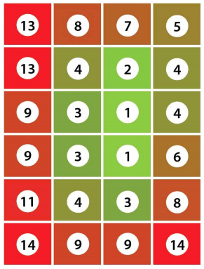
As the basis for our own research, we used a research paper by Amy K. Karlson, Benjamin B. Bederson and Jose L. Contreras-Vidal, titled Understanding Single-Handed Mobile Device Interaction. In their research, they developed a region map to test the difficulty of reach on different regions of the screen of a phone. As this research paper was from 2006, they had data from older models of phones (from small and flip phones to PDAs), so we had to adapt the region map to smartphones which had larger screens. Their research paper was also focused on usability of phones in general, while ours was focused on usability and safety of use with Game Development in mind.

We adapted the region map to our own version that could be used with modern (at the time) smartphones.
We overlayed the region map on top of some popular games at the time to see if their elements were laid out in a way that made it comfortable for the user to access interactable elements and found out that a remarkable amount of games left buttons and other interactable UI elements outside of comfortable to reach areas. Even games that had very one-handed-friendly gameplay had menus that were really difficult to use, an example being Minion Rush.
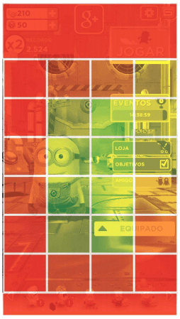
Our findings made it clear that the optimal setup for comfortable and safe one-handed play is to leave interactable buttons and elements within the green areas of the region map, and important visual-only elements (like score, resources, or any important elements that are not interactable) inside the red areas.
Here are the final considerations of our paper. I hope this knowledge can be useful to everyone:
CONCLUSION
The study of the different concepts applied here allows us to conclude that it is possible to develop video games for smartphones in a way that is comfortable to be enjoyed with a single hand in the most diverse real-life situations. For that, it is extremely important that the Game Designer thinks about the way that the player is going to interact with the mobile device while playing their game.
Knowing the limitations of the human thumb is the key piece of the puzzle. The Game Designer, therefore, must: Avoid utilizing thumb movements and input commands in directions that are detrimental to the performance of tasks executed by the user; Position Interface and Input elements that are frequently used in areas of easy interaction and avoid at all costs positioning important input elements in areas of difficult access; Have knowledge of the diverse sizes of devices in which their application is going to be released, and develop their video game in a modular way that always takes into account the size of the device and the reach of the thumb of the user, repositioning every element of interaction.
It is possible to conclude that the direction of the task, the region it is applied in and the device itself can have variables that make the one-handed interaction process difficult. All the same, those are factors that can be avoided with a few good design practices, as they are tied to input elements in the region of interaction, the shape of the device, and other details that can be predefined and predicted. The only inalterable element is the thumb of the user.
It is important to consider as well that other than physical limitations, the thumb is located between the action of the game and the eyes of the player, demanding attention from the Game Designer into the visual elements of the game, and how they are displayed.
The increase in options of devices with bigger screens is remarkable, what would otherwise be a problem can also become an important ally in the making of these video games and their display areas, as there’s more real state far from the reach of the thumb. If the area of interaction is modular and adjustable, the video game in question can be perfectly played in the portrait position, with a single hand, in a safe and comfortable way.
This study opens a new area for the video game market: one that is almost unexplored. As we’ve seen, although some games allow their usage in this way, all of them showed flaws in important interaction elements, simply due to the fact that they weren’t thought to be executed in this way. They are simple changes, fine adjustments that make all the difference.
After the research was done, we started development of our game to prove our findings. Due to some shortcomings, I ended up having to do the game almost entirely by myself (with the exception of the audio design, which was done by a fellow member of the team) while the rest of the team worked on other things, like the marketing analysis, presentations, and formatting our research paper.
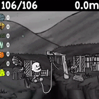
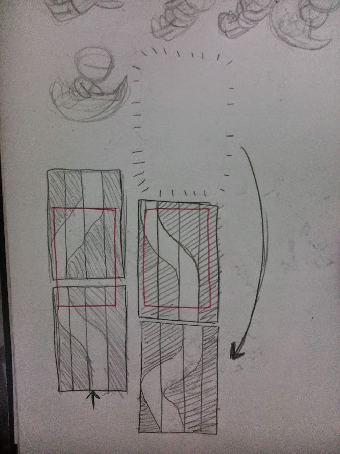
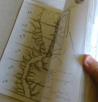
Endless games were all the rage back then, so we decided to make something similar. While sketching ideas on my commutes back home, I sketched an idea of an infinite Ravine that you fell into while attached to a rope, and you had to go as far down as you could without dying, or until your rope ran out.
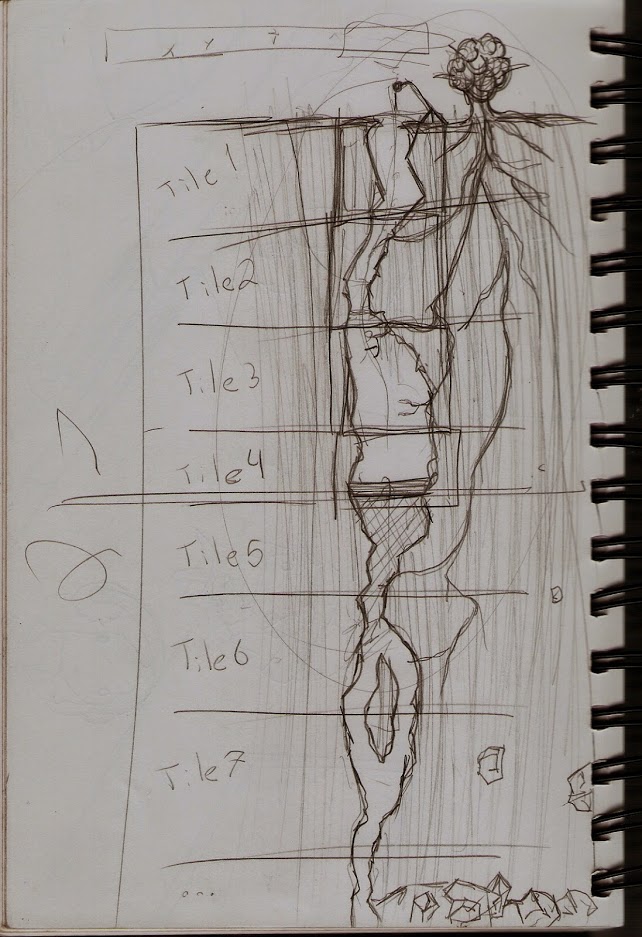

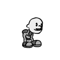
For the setting of the game, we decided it was going to be about a researcher who found out that a mysterious ravine was going to open and unleash unknown horrors and great treasures, and after being mocked by his community, decided to explore it.
Back then we had the very first teaser for Cuphead and we were fascinated by the artstyle. So we decided to do the visuals in a similar fashion, and it ended up looking what I today call “Dollarstore cuphead”.


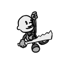

We developed the gameplay while keeping the research in mind at all times. The UI elements and gameplay were all designed in a way that made it easy to play the game while holding the phone with a single hand.

At the end of the year, we presented our reseach paper and the game and the board of teachers really liked it, commenting on the fact that the research was about a real problem with real world applications and it had potential to be very useful in the game industry, especially considering the big tendency of growth in the mobile game market. That marked the end of four hard academic, and we finally proceeded to get our Bachelor degree in Game Design.
You can download an .apk of the game here. It’s in Brazilian portuguese, but it doesn’t matter too much as the game has very little text and the gameplay is somewhat intuitive.
